Exhibitions, Research, Criticism, Commentary
A chronology of 3,585 references across art, science, technology, and culture
“An artist can bring a protest’s typography into an art space or institution, not to sterilize it or water it down, but to keep it from getting lost to a materialistic news cycle that is only focused on what’s next.”
“Code as Canvas: Creative Graphics in the Age of AI” sees Zach Lieberman and friends evoke code’s expressive potential at the Gwangju Media Art Platform (G.MAP) in South Korea. It features Lieberman’s MIT Media Lab Future Sketches group alongside artists including Peter Cho, Susan Detroy, and Bob Faust to explore interactive typography, AI-generated imagery, kaleidoscopic patterns, and cosmic data visualizations that reimagine programming as “sculptural language.”

“Another day. Another night.,” Barbara Kruger’s first comprehensive Spanish survey fills Guggenheim Bilbao with text-based provocations spanning five decades. The American artist’s signature declarations challenge structures of power, identity, and control across walls, floors, and screens. Untitled (Forever) (2017/2025), a site-specific installation, surrounds visitors in Spanish and Basque text, weaving George Orwell’s dystopian warnings with Virginia Woolf’s insights on gendered power dynamics.

“The large, square, prints on C-type paper hold the attention effortlessly, having a modernist typographical level of simplicity, while simultaneously conveying a point of radical transition from a logic of held type to a logic of generative data.”
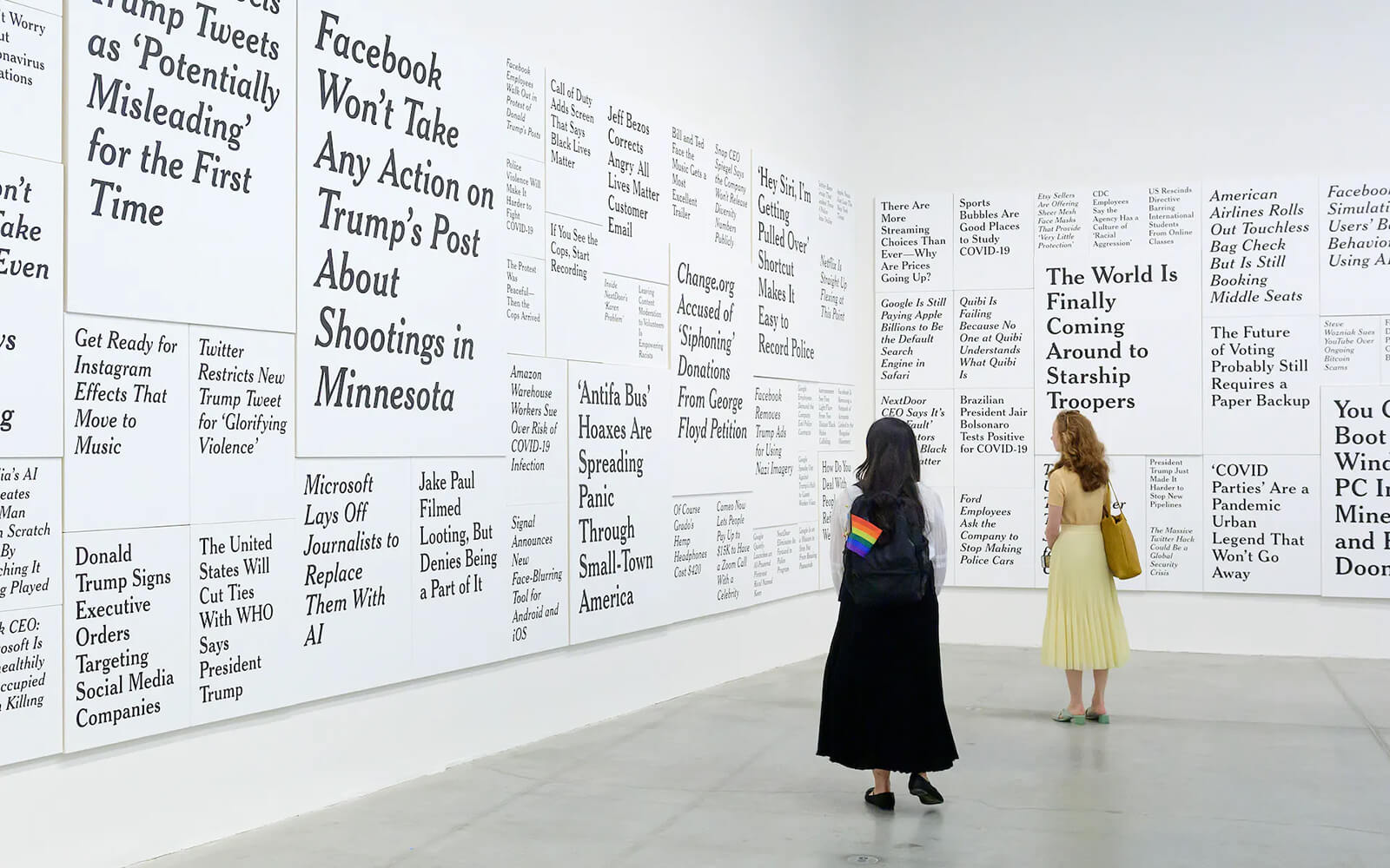
“WE DID THIS TO OURSELVES,” a survey of Ron Terada’s news and typography-focused works, opens at The Power Plant in Toronto. Grimly articulating the surrealism and noise of the post-truth information landscape, the Canadian artist’s monumental painting series TL;DR (2017-22) takes centre stage, immersing gallery visitors in the “overwhelming experience” of perusing a wall of weird tech headlines (collected from The Verge) rendered in the familiar and authoritative New York Times typeface.
Central London live music venue Outernet debuts a new kinetic identity designed by type and motion studios NaN and DBLG. Dense and dynamic, a grid of animated wordmarks and mutating colourful 3D forms scroll across the venue’s prominent 200 m media façade. NaN describes their contributed custom tilted display monospace typeface as drawing inspiration from “coding vernacular,” a graphic “doubling down on the tech-oriented physical internet identity of the venue.”
“For most people, Arial, designed in 1982 and released as a TrueType font in 1992 is the typical digital font. It was already a mockery of Helvetica, born in 1957.”
SAMSUNG MEANS REBIRTH premieres, as part of the 11th Seoul Mediacity Biennale. Squarely focused on South Korea’s most prominent technology multinational, Young-Hae Chang Heavy Industries’ seven-episode video series offers an unflinching look at Samsung’s fervent corporate ethos and poses related questions of labour and value. In the first episode “The Executive,” tales of obedience and overreach are spelled out in big punchy typography—bleak narratives of corporatized death and devotion, synchronized with a jazzy score.
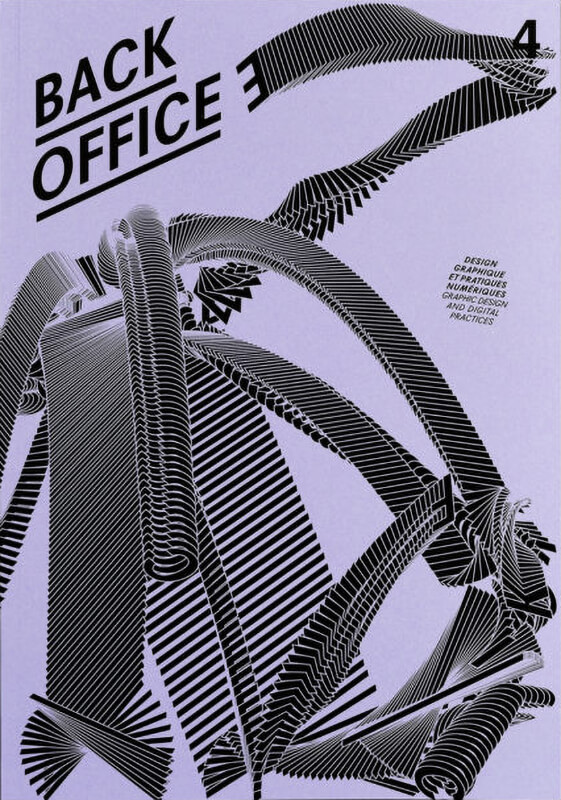
Back Office 4
Go With the Flow
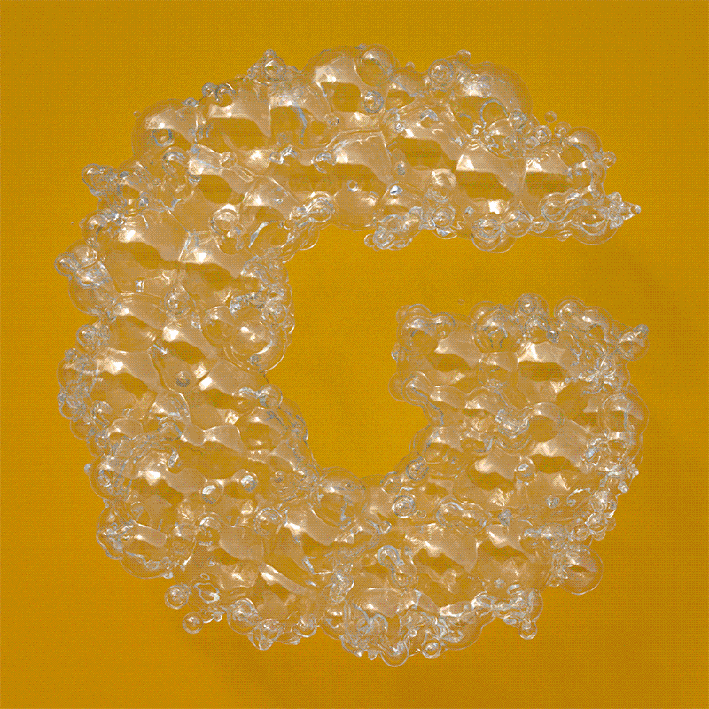
“Like mushrooms themselves, the font changes unpredictably, illustrating how fungi can be both an aesthetic and a methodology for rethinking how images and objects can form and grow.”
“A broadly told story is that Kante was rankled over a daily paper article by a Lebanese correspondent comparing African dialects to ‘those of the birds, impossible to transcribe’.”
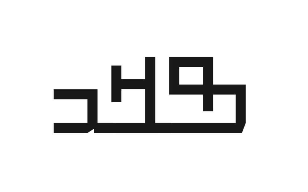
Software engineer and electronics hacker Ian Hanschen shares his vast bitmap font collection that he pulled from various demoscene archives over the years. The catalog includes hundreds of glorious pixel letterform sheets created on the Commodore 64, Atari, and Amiga home computers in the late 1980s and early ’90s. “I don’t remember where much of this collection came from,” Hanschen writes about the missing metadata. “I just thought after finding a few of these [archives] had died that I should make it available.”
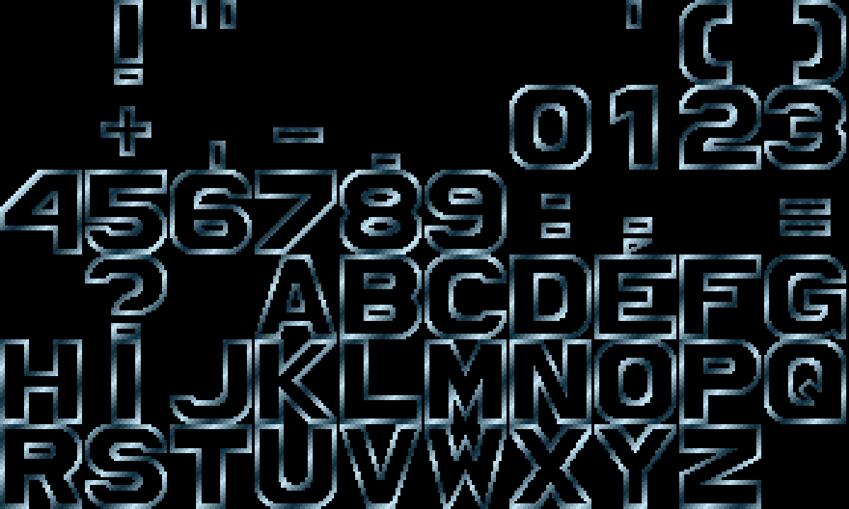
The culmination of a year of exploring emergent letterforms through machine learning and computation, Berlin-based type practice (and HOLO collaborator) NaN releases a collection of 28 procedurally generated display fonts and the codebase that was used to create them. Free-to-use and free-to-modify, the expressive set demonstrates that “scripting designs in this fashion can be both a creative and production tool,” writes NaN’s Luke Prowse. “There’s no reason why these scripts can’t be applied to icons, lettering or any other vectors either.”
Daily discoveries at the nexus of art, science, technology, and culture: Get full access by becoming a HOLO Supporter!
- Perspective: research, long-form analysis, and critical commentary
- Encounters: in-depth artist profiles and studio visits of pioneers and key innovators
- Stream: a timeline and news archive with 3,100+ entries and counting
- Edition: HOLO’s annual collector’s edition that captures the calendar year in print